Updated
June 5, 2018
Written by
New Media Services
Banner design is a fundamental component of online branding. When marketing a business’ products and services, catering to the visual component of the target audience’s purchasing intent and behavior is a crucial factor. Banners are among the most prevalent forms of graphic design used to market services at present.
The addition of graphics and visuals in the form of banners in blogs and contents used for product promotions is one way businesses can impact their customers better and be more memorable. Aside from the aforementioned, banners can likewise be used for the following purposes:
Aside from underlining the visual aspect of marketing, the use of banners provides a cost-effective and time-saving tool for businesses to let their services known to a wider range of customers and business affiliates.
To help make the use of banners more effective, keeping tabs with the latest trends in banner design is also a must. 2018 has quite a line-up of necessary changes for banner design, and these are:
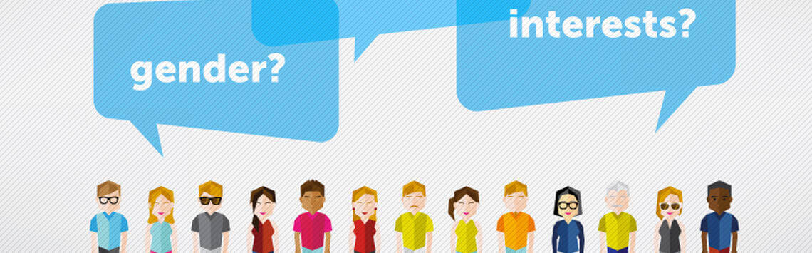
Creating and designing banners does not just reflect a brand’s distinctive personality. It must likewise respond well to the unique and defining qualities of a business’ target customers. From the context of the design to the color combination used, every bit should be carefully structured to ensure the right people are being engaged and that audience interest is also sustained.
If a brand targets fellow businesses, it would be best to choose colors and fonts that evoke professionalism, power, intellect, formality, wisdom, prestige and modernity. On the other hand, if the target audience belongs to a younger age group, then shades and designs that embody youthfulness, cheerful emotions, hope, innovation, and a zestful outlook would be the best option.
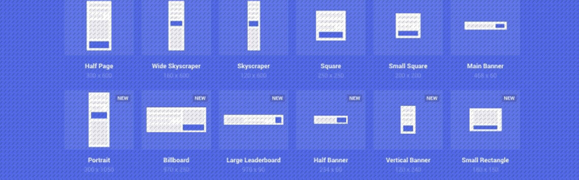
Google Adsense has provided standard banner sizes that have been determined to amply market services. In their guideline for ad sizes, the advantages presented by each size are explained. The most successful banner sizes are as follows:
Additional banner sizes that are still considered to be very useful are:
File sizes and formats are crucial in making successful and effective banners. According to Google, 150kb is the maximum file size for banner ads. The problem with file sizes that exceed the said ideal measurement is that it takes longer for it to be loaded on the site page.
Slow-loading banners and ads are among the most common factors that cause bad user experience. As for the file types, animated banners should be saved in GIF format, while stationary and non-animated ones should be in either GIF, JPG, PNG, SWF, and ZIP format.
Colors and fonts are very powerful influencers and mood setters. When strategically combined together, the right emotions, ideas and reactions can be spurred. When marketing a brand’s services, incorporating the colors of the business logo, or adding the logo itself will help imprint the brand better into the audience’s minds.
To help choose the best color combination for a banner, it would be best to stick with a small color palette first, then from there, experiment on the color combinations. Include neutral shades like black, white, and gray as well to provide balance to the banner’s overall color quality.
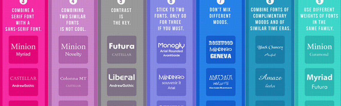
When it comes to choosing the right font for a banner design, it takes a little bit of experimentation before a designer can determine the most suitable font to go with. To avoid creating too much ‘clutter’ or ‘noise’, it is best to stick to 2 font variations.
Additional tip for using the most appropriate font types is to avoid using cursive fonts or styles that are difficult to read, as well as fonts that are all in the uppercase format. Uniform font styles will make the banner’s overall look more put together and consistent. At the same time, proper font spacing maximizes the banner’s dimensions and spaces more efficiently.

Cohesive and strategically crafted banners are the result of adding images with high significance to what the banner embodies. Depending on the availability of resources, designers can create graphics, have photos professionally shot for a particular design, or purchase affordable licenses for stock photos.
Determining the picture that is most suitable for the banner design is one way to ensure images are included smartly into the overall concept of the banner. Usually, images are incorporated to show customers a sneak-peek of the products being offered by a brand; and it is this area in banner creation that most business owners fail to employ adequately.
For example, depicting more than one product samples as opposed to focusing on just one variant will confuse the target audience. But, when a banner ad contains an image of one product, more concise information can be added to make the graphic more informative.
White space, or otherwise called negative space, refers to the areas on a page or banner that is left empty or unmarked. White space can be manipulated to create images out of another set of graphics or make the audience focus on a singular element in the banner.
Not to be taken literally, white space does not necessarily have to be white in color. It will depend on the background color of the website or banner design. Whitespace is important in making sure the elements present in the design, such as the text, images, and graphics are expertly and elegantly arranged.
Negative space helps let the visual quality “breathe” and evoke higher level of sophistication. Imagine a banner that is filled in every corner with texts and images—it becomes less impactful and more of an eyesore for the viewers.
Buttons and calls-to-actions in banners often go together to drive higher engagement and conversion in customers.
This is especially applicable in banner ads. The ideal placement of buttons in banners is on the lower right side of the banner, below the main message or the central image of the design.
The careful use of contrasting colors also comes into play when including buttons. If the button’s color is in the same hue as that of the background, then it will be less noticeable to the customers.
Designing banner ads takes into consideration how the placement of each element will successfully boost brand awareness and CTRs. There is an art and a strategy to how the contents of a banner are arranged.
In the so-called hierarchy of content, the company logo, value proposition, and call to action are the three vital components that must be present in a good banner design.
The brand logo must visually be the most dominant, but not by way of taking up the most space. It should be visible enough but not too eye-catching that it steals attention away from other important details in the banner.
Value proposition contains the services and products that customers can avail from the brand, along with specific promotions being offered, if there are any. Examples of content found in value propositions include ‘50% Off’, ‘Limited Offer’, and ‘3-Day-Sale’.
Promotions and limited offers must be placed or designed more strikingly than the logo because this is the very factor that will draw customers to learn more about the brand or subscribe to its services.
Finally, the call to action will direct what the viewers need to do to gain better access to the promotions or products that they wish to avail. Calls to action contain 2-3 words that are very persuasive in nature. Some common examples include, ‘Click Here’, ‘Subscribe Now’, ‘Register Here’, and ‘Get a Quote’.
Randomly placing images and text in a blank space, without first understanding the objective of the design cannot be considered a banner creation. Banner design requires skill, an innate passion for elegant and constructive designs, creativity, and most importantly, high adaptability to varying customer requirements and demands.
By opting to employ competitive banner design services, businesses are paving the way to harness their online branding along with their strategies for advertising their services. As such, to ensure that businesses get the most of graphic and web design in the form of creating banners, hiring or outsourcing experienced and professional designers is one way to achieve that.
Banners exhibit how text and images can blend together to influence how people perceive a business or a service and drive them to support a specific brand.
Simpler designs with powerful, engaging, and suitable messages are better than eye-catching graphics that provide zero significance to what the brand aims to convey to its customers. Forgetting the purpose of the design is one grave mistake that designers need to avoid in order to produce outputs that both the business owner and the customers will positively respond to.
Want to contribute to NMS or SMS Go blogs and work with us in cross-promotions? Contact us and we can discuss how we can share content that will benefit both our businesses!
Banner design is a fundamental component of online branding. When marketing a business’ products and services, catering to the visual component of the target audience’s purchasing intent and behavior is a crucial factor. Banners are among the most prevalent forms of graphic design used to market services at present.
The addition of graphics and visuals in the form of banners in blogs and contents used for product promotions is one way businesses can impact their customers better and be more memorable. Aside from the aforementioned, banners can likewise be used for the following purposes:
Aside from underlining the visual aspect of marketing, the use of banners provides a cost-effective and time-saving tool for businesses to let their services known to a wider range of customers and business affiliates.
To help make the use of banners more effective, keeping tabs with the latest trends in banner design is also a must. 2018 has quite a line-up of necessary changes for banner design, and these are:
Creating and designing banners does not just reflect a brand’s distinctive personality. It must likewise respond well to the unique and defining qualities of a business’ target customers. From the context of the design to the color combination used, every bit should be carefully structured to ensure the right people are being engaged and that audience interest is also sustained.
If a brand targets fellow businesses, it would be best to choose colors and fonts that evoke professionalism, power, intellect, formality, wisdom, prestige and modernity. On the other hand, if the target audience belongs to a younger age group, then shades and designs that embody youthfulness, cheerful emotions, hope, innovation, and a zestful outlook would be the best option.
Google Adsense has provided standard banner sizes that have been determined to amply market services. In their guideline for ad sizes, the advantages presented by each size are explained. The most successful banner sizes are as follows:
Additional banner sizes that are still considered to be very useful are:
File sizes and formats are crucial in making successful and effective banners. According to Google, 150kb is the maximum file size for banner ads. The problem with file sizes that exceed the said ideal measurement is that it takes longer for it to be loaded on the site page.
Slow-loading banners and ads are among the most common factors that cause bad user experience. As for the file types, animated banners should be saved in GIF format, while stationary and non-animated ones should be in either GIF, JPG, PNG, SWF, and ZIP format.
Colors and fonts are very powerful influencers and mood setters. When strategically combined together, the right emotions, ideas and reactions can be spurred. When marketing a brand’s services, incorporating the colors of the business logo, or adding the logo itself will help imprint the brand better into the audience’s minds.
To help choose the best color combination for a banner, it would be best to stick with a small color palette first, then from there, experiment on the color combinations. Include neutral shades like black, white, and gray as well to provide balance to the banner’s overall color quality.
When it comes to choosing the right font for a banner design, it takes a little bit of experimentation before a designer can determine the most suitable font to go with. To avoid creating too much ‘clutter’ or ‘noise’, it is best to stick to 2 font variations.
Additional tip for using the most appropriate font types is to avoid using cursive fonts or styles that are difficult to read, as well as fonts that are all in the uppercase format. Uniform font styles will make the banner’s overall look more put together and consistent. At the same time, proper font spacing maximizes the banner’s dimensions and spaces more efficiently.
Cohesive and strategically crafted banners are the result of adding images with high significance to what the banner embodies. Depending on the availability of resources, designers can create graphics, have photos professionally shot for a particular design, or purchase affordable licenses for stock photos.
Determining the picture that is most suitable for the banner design is one way to ensure images are included smartly into the overall concept of the banner. Usually, images are incorporated to show customers a sneak-peek of the products being offered by a brand; and it is this area in banner creation that most business owners fail to employ adequately.
For example, depicting more than one product samples as opposed to focusing on just one variant will confuse the target audience. But, when a banner ad contains an image of one product, more concise information can be added to make the graphic more informative.
White space, or otherwise called negative space, refers to the areas on a page or banner that is left empty or unmarked. White space can be manipulated to create images out of another set of graphics or make the audience focus on a singular element in the banner.
Not to be taken literally, white space does not necessarily have to be white in color. It will depend on the background color of the website or banner design. Whitespace is important in making sure the elements present in the design, such as the text, images, and graphics are expertly and elegantly arranged.
Negative space helps let the visual quality “breathe” and evoke higher level of sophistication. Imagine a banner that is filled in every corner with texts and images—it becomes less impactful and more of an eyesore for the viewers.
Buttons and calls-to-actions in banners often go together to drive higher engagement and conversion in customers.
This is especially applicable in banner ads. The ideal placement of buttons in banners is on the lower right side of the banner, below the main message or the central image of the design.
The careful use of contrasting colors also comes into play when including buttons. If the button’s color is in the same hue as that of the background, then it will be less noticeable to the customers.
Designing banner ads takes into consideration how the placement of each element will successfully boost brand awareness and CTRs. There is an art and a strategy to how the contents of a banner are arranged.
In the so-called hierarchy of content, the company logo, value proposition, and call to action are the three vital components that must be present in a good banner design.
The brand logo must visually be the most dominant, but not by way of taking up the most space. It should be visible enough but not too eye-catching that it steals attention away from other important details in the banner.
Value proposition contains the services and products that customers can avail from the brand, along with specific promotions being offered, if there are any. Examples of content found in value propositions include ‘50% Off’, ‘Limited Offer’, and ‘3-Day-Sale’.
Promotions and limited offers must be placed or designed more strikingly than the logo because this is the very factor that will draw customers to learn more about the brand or subscribe to its services.
Finally, the call to action will direct what the viewers need to do to gain better access to the promotions or products that they wish to avail. Calls to action contain 2-3 words that are very persuasive in nature. Some common examples include, ‘Click Here’, ‘Subscribe Now’, ‘Register Here’, and ‘Get a Quote’.
Randomly placing images and text in a blank space, without first understanding the objective of the design cannot be considered a banner creation. Banner design requires skill, an innate passion for elegant and constructive designs, creativity, and most importantly, high adaptability to varying customer requirements and demands.
By opting to employ competitive banner design services, businesses are paving the way to harness their online branding along with their strategies for advertising their services. As such, to ensure that businesses get the most of graphic and web design in the form of creating banners, hiring or outsourcing experienced and professional designers is one way to achieve that.
Banners exhibit how text and images can blend together to influence how people perceive a business or a service and drive them to support a specific brand.
Simpler designs with powerful, engaging, and suitable messages are better than eye-catching graphics that provide zero significance to what the brand aims to convey to its customers. Forgetting the purpose of the design is one grave mistake that designers need to avoid in order to produce outputs that both the business owner and the customers will positively respond to.
Want to contribute to NMS or SMS Go blogs and work with us in cross-promotions? Contact us and we can discuss how we can share content that will benefit both our businesses!
Help us devise custom-fit solutions specifically for your business needs and objectives! We help strengthen the grey areas on your customer support and content moderation practices.
New Media Services Offices
Email Us
A good company is comprised of good employees. NMS-AU encourages our workforce regardless of rank or tenure to give constructive ideas for operations improvement, workplace morale and business development.