Updated
September 6, 2022
Written by
New Media Services
Attracting a large number of people's attention with visually appealing content is no longer the only goal of a good email design. To design an email in today's extremely demanding and competitive industry is to interact with your target audience on a more personal level. It is to develop quality emails that are capable of projecting the vision of your brand, introducing your products, and eventually raising your overall conversion rate more effectively. After all, emails are the instrument that enable you to actively approach people through their inboxes.
Does it feel like the number of people clicking on your emails is changing? Have you recently seen a drop in the number of your subscribers? Or do you have the impression that your competitors are leaving you in the dust? If this is the case, it is possible that you are utilizing emails the wrong way.

In essence, email design is a deliberate approach to developing emails with the purpose of conforming to a company's target prospects, particularly those on their subscriber or email lists. An excellent marketing email design should be visually captivating, timely, intriguing, and most importantly, demonstrate brand relevance. Crossing out all that helps ensure that your email messages can grab the attention of prospects and deepen their overall engagement with the company.
The vast majority of companies invest endless hours and a sizable amount of money to ensure that the user experience provided by their websites is among the best. On the other hand, they often undervalue the significance of carefully crafted email designs in promoting their company. They are missing the bigger picture, which is that emails have the potential to be an effective and powerful tool for reaching their target clients. No matter how extensive the email's content may be, if it does not have a suitable design, it will be impossible for the email to successfully communicate its intended message. Also, an excellent email design can instantly attract the interest of the recipients, encouraging the recipients to continue reading the email.
Before you learn how to design an email, first, try to understand why it matters in the first place. Here is a quick look at the benefits of an exquisite and carefully strategized email design;
Measuring how successfully your emails connect with clients should be at the top of your priority list if you want to prosper in digital marketing. The less you know about how your target demographics respond to your audience reach strategies, the more difficult it is to devise an actionable plan to fine-tune your initiatives.
You can accomplish this by utilizing a variety of KPIs and indicators, including open rates, click rates, bounce rates, subscriber engagement, and conversion. Keeping watch on such indicators will help you identify all of the necessary assessments and adjustments for improved client engagement.
Take note: You won’t be able to track these metrics unless you send these emails in HTML format.
As opposed to plain text emails, HTML emails with professionally made designs, allows you to convey what you actually want to convey. After all, the brain tends to process images faster than a purely text-based message. Incorporating visually attractive and interactive elements helps increase the rate at which clients absorb and digest information.
Email design allows you to engage clients regardless of their browsing preference—desktop or mobile. Remember that your click-through rates are strongly dependent on how well you present your emails, from the subject line and body to the call-to-action button. Simple mistakes such as using low-quality graphics, adding irrelevant design components, or a simple typo might cause readers to discard your emails in seconds.
You're probably thinking that the "designing" part is as straightforward as it gets just by reading it. You only need a few flashy fonts and pictures here and there, right?
Well, guess again.
The truth is that there are various variables to consider before you can begin working on your email and producing the most eye-catching and on-brand emails. First and foremost, you must identify your target audiences. Then, determine the goal and purpose of your email to potentially direct your clients to follow or check out what is offered in the email. Doing so makes it easier to assess how your existing email marketing activities are impacting your target demographics. As a result, it will be easier for you to devise more effective strategies that will significantly benefit your organization.
You do not necessarily have to be an email design guru. All you need to generate an email design that works with your desired recipients is to establish your marketing priorities and understand the fundamentals.
As promised, here are some email design tips to help you launch your next successful email marketing campaign;
No matter how good your email design, if you have a lousy introductory subject line, people will lose interest and end up sending your email straight into their inbox’s trash bin. In email marketing, your subject line plays a vital role in enticing your prospects to click and open your message since it is the first thing they see in your emails. Make sure to nail this part. Otherwise, all your design efforts will be futile.
See to it that your subject lines demonstrate relevance, timeliness, and adhere to your target audiences’ preferences. It must also address recipients with a personalized touch.
Below are some pointers to remember when creating a killer subject line:
This part is as simple as it gets. Incorporating your logo into your emails leaves an impression on customers' thoughts because it symbolizes your brand. It boosts brand awareness and allows your customers to recognize your brand anytime they see it.
While breaking some rules is inevitable in keeping up with customer preferences, it is important to stay by the book when it comes to your branding. Ensure that your email's portrayal of your brand is accurate and does not deviate from your company's identity.
Take a look at the following pointers to stay consistent with your branding:
For example, if you're sending Christmas-themed marketing emails, a hint of green, crimson, or gold will suffice. Just make sure it doesn't overshadow your branding palette!
Also, your font size must be consistent with the industry standard. Your best bet is to use font size between 14 and 16. The key is to ensure your message is visible and clear to your readers without the need for them to squint their eyes or adjust their glasses.
This makes it easy for you to convey your message. As a result, you have the opportunity to acquire their trust and potentially persuade them to try the things your firm has in store for them.
Photos and videos are undoubtedly the best additions to a marketing email. These are effective attention grabbers that alleviate eye strain caused by blocks upon blocks of text. There are numerous websites where you can acquire free stock images or vectors to use to embellish your email.
Check that these images are also accompanied by alt text to guarantee that your recipients understand your message even if the image does not load properly.
In terms of video, including it in your emails allows you to enhance how you show your brand to your prospects. Videos drastically speed up the explanation process. At present, Gmail and Outlook do not yet support playing in-mail videos. Nonetheless, you could always provide a link to your videos on your YouTube channel or website. Add a prominent CTA to redirect recipients to your video!
It's hard not to be tempted to pepper your email with an enticing aesthetic and tons of graphic elements. Unfortunately, overdecorating tends to overwhelm readers and leave a bad taste on your brand.
At times, simplicity is all you need if you want to win the hearts of your customers. If you’ve ever heard of white space, it is a term in design that refers to any empty space or blank area that surrounds a design element, composition, or layout.
White space does an amazing job of accentuating the calls to action that you have included in your writing. Be careful not to cram your email with excessive CTAs or CTA buttons, though! Use them sparingly but smartly. Put them in the locations where they will leave a stronger and long-lasting impact to your recipients.
Produce emails that are optimized for all types of users, particularly mobile users. Keep in mind that browsing on mobile devices is progressively replacing browsing on desktop computers. To put it another way, it is necessary to send emails that, when viewed on a mobile device, will still appear to be of high quality.
In some instances, the design looks great on the desktop, but it gets cluttered when viewed on a mobile device. It should become a routine for you to test your emails before sending them to ensure that they look just as excellent on both desktop computers and mobile devices. More importantly, check that your calls to action are working and that the readers can scroll through the contents of your message with ease.
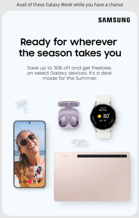
We have collected a few examples of quality email designs.
Subject Line: Galaxy Week is almost over! 🚀
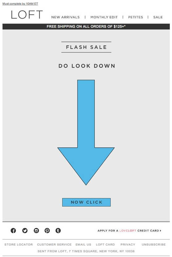
Check out LOFT’s minimalistic take on their email content:
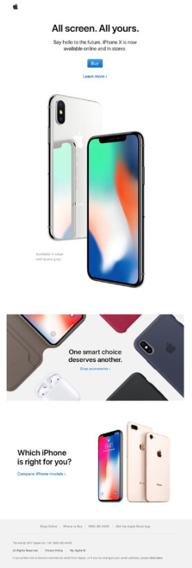
Here’s how Apple hooks its customers:
This is what a good white spacing looks like:

Did you know that you can also incorporate your customer support into your email when designing them?
When paired with fully functioning and responsive calls-to-action, you can introduce your help desk services to customers and prospects. If your firm does not provide email support, you can always employ the benefits of outsourcing.
We couldn’t agree more!
Well-crafted emails are your bread and butter for reaching and resonating with your target market. Dedicating time to come up with an impactful email will help you establish a stronger connection with your current user base and entice more prospects to check out what your brand has to offer.
New Media Services offer email support outsourcing services for all types of businesses. We provide a cost-effective and innovative solution for email help desk-related dilemmas. Get access to the finest cloud-based reply tool to provide the best user experience possible. Allow your customers to reach out to your team without requiring them to scour your website’s pages to find your contact information.
To know more about our email outsourcing solutions, message us!
Attracting a large number of people's attention with visually appealing content is no longer the only goal of a good email design. To design an email in today's extremely demanding and competitive industry is to interact with your target audience on a more personal level. It is to develop quality emails that are capable of projecting the vision of your brand, introducing your products, and eventually raising your overall conversion rate more effectively. After all, emails are the instrument that enable you to actively approach people through their inboxes.
Does it feel like the number of people clicking on your emails is changing? Have you recently seen a drop in the number of your subscribers? Or do you have the impression that your competitors are leaving you in the dust? If this is the case, it is possible that you are utilizing emails the wrong way.

In essence, email design is a deliberate approach to developing emails with the purpose of conforming to a company's target prospects, particularly those on their subscriber or email lists. An excellent marketing email design should be visually captivating, timely, intriguing, and most importantly, demonstrate brand relevance. Crossing out all that helps ensure that your email messages can grab the attention of prospects and deepen their overall engagement with the company.

The vast majority of companies invest endless hours and a sizable amount of money to ensure that the user experience provided by their websites is among the best. On the other hand, they often undervalue the significance of carefully crafted email designs in promoting their company. They are missing the bigger picture, which is that emails have the potential to be an effective and powerful tool for reaching their target clients. No matter how extensive the email's content may be, if it does not have a suitable design, it will be impossible for the email to successfully communicate its intended message. Also, an excellent email design can instantly attract the interest of the recipients, encouraging the recipients to continue reading the email.

Before you learn how to design an email, first, try to understand why it matters in the first place. Here is a quick look at the benefits of an exquisite and carefully strategized email design;
Measuring how successfully your emails connect with clients should be at the top of your priority list if you want to prosper in digital marketing. The less you know about how your target demographics respond to your audience reach strategies, the more difficult it is to devise an actionable plan to fine-tune your initiatives.
You can accomplish this by utilizing a variety of KPIs and indicators, including open rates, click rates, bounce rates, subscriber engagement, and conversion. Keeping watch on such indicators will help you identify all of the necessary assessments and adjustments for improved client engagement.
Take note: You won’t be able to track these metrics unless you send these emails in HTML format.
As opposed to plain text emails, HTML emails with professionally made designs, allows you to convey what you actually want to convey. After all, the brain tends to process images faster than a purely text-based message. Incorporating visually attractive and interactive elements helps increase the rate at which clients absorb and digest information.
Email design allows you to engage clients regardless of their browsing preference—desktop or mobile. Remember that your click-through rates are strongly dependent on how well you present your emails, from the subject line and body to the call-to-action button. Simple mistakes such as using low-quality graphics, adding irrelevant design components, or a simple typo might cause readers to discard your emails in seconds.
You're probably thinking that the "designing" part is as straightforward as it gets just by reading it. You only need a few flashy fonts and pictures here and there, right?
Well, guess again.
The truth is that there are various variables to consider before you can begin working on your email and producing the most eye-catching and on-brand emails. First and foremost, you must identify your target audiences. Then, determine the goal and purpose of your email to potentially direct your clients to follow or check out what is offered in the email. Doing so makes it easier to assess how your existing email marketing activities are impacting your target demographics. As a result, it will be easier for you to devise more effective strategies that will significantly benefit your organization.
You do not necessarily have to be an email design guru. All you need to generate an email design that works with your desired recipients is to establish your marketing priorities and understand the fundamentals.
As promised, here are some email design tips to help you launch your next successful email marketing campaign;
No matter how good your email design, if you have a lousy introductory subject line, people will lose interest and end up sending your email straight into their inbox’s trash bin. In email marketing, your subject line plays a vital role in enticing your prospects to click and open your message since it is the first thing they see in your emails. Make sure to nail this part. Otherwise, all your design efforts will be futile.
See to it that your subject lines demonstrate relevance, timeliness, and adhere to your target audiences’ preferences. It must also address recipients with a personalized touch.
Below are some pointers to remember when creating a killer subject line:
This part is as simple as it gets. Incorporating your logo into your emails leaves an impression on customers' thoughts because it symbolizes your brand. It boosts brand awareness and allows your customers to recognize your brand anytime they see it.
While breaking some rules is inevitable in keeping up with customer preferences, it is important to stay by the book when it comes to your branding. Ensure that your email's portrayal of your brand is accurate and does not deviate from your company's identity.
Take a look at the following pointers to stay consistent with your branding:
For example, if you're sending Christmas-themed marketing emails, a hint of green, crimson, or gold will suffice. Just make sure it doesn't overshadow your branding palette!
Also, your font size must be consistent with the industry standard. Your best bet is to use font size between 14 and 16. The key is to ensure your message is visible and clear to your readers without the need for them to squint their eyes or adjust their glasses.
This makes it easy for you to convey your message. As a result, you have the opportunity to acquire their trust and potentially persuade them to try the things your firm has in store for them.
Photos and videos are undoubtedly the best additions to a marketing email. These are effective attention grabbers that alleviate eye strain caused by blocks upon blocks of text. There are numerous websites where you can acquire free stock images or vectors to use to embellish your email.
Check that these images are also accompanied by alt text to guarantee that your recipients understand your message even if the image does not load properly.
In terms of video, including it in your emails allows you to enhance how you show your brand to your prospects. Videos drastically speed up the explanation process. At present, Gmail and Outlook do not yet support playing in-mail videos. Nonetheless, you could always provide a link to your videos on your YouTube channel or website. Add a prominent CTA to redirect recipients to your video!
It's hard not to be tempted to pepper your email with an enticing aesthetic and tons of graphic elements. Unfortunately, overdecorating tends to overwhelm readers and leave a bad taste on your brand.
At times, simplicity is all you need if you want to win the hearts of your customers. If you’ve ever heard of white space, it is a term in design that refers to any empty space or blank area that surrounds a design element, composition, or layout.
White space does an amazing job of accentuating the calls to action that you have included in your writing. Be careful not to cram your email with excessive CTAs or CTA buttons, though! Use them sparingly but smartly. Put them in the locations where they will leave a stronger and long-lasting impact to your recipients.
Produce emails that are optimized for all types of users, particularly mobile users. Keep in mind that browsing on mobile devices is progressively replacing browsing on desktop computers. To put it another way, it is necessary to send emails that, when viewed on a mobile device, will still appear to be of high quality.
In some instances, the design looks great on the desktop, but it gets cluttered when viewed on a mobile device. It should become a routine for you to test your emails before sending them to ensure that they look just as excellent on both desktop computers and mobile devices. More importantly, check that your calls to action are working and that the readers can scroll through the contents of your message with ease.
We have collected a few examples of quality email designs.
Subject Line: Galaxy Week is almost over! 🚀

Check out LOFT’s minimalistic take on their email content:

Here’s how Apple hooks its customers:

This is what a good white spacing looks like:

Did you know that you can also incorporate your customer support into your email when designing them?
When paired with fully functioning and responsive calls-to-action, you can introduce your help desk services to customers and prospects. If your firm does not provide email support, you can always employ the benefits of outsourcing.
We couldn’t agree more!
Well-crafted emails are your bread and butter for reaching and resonating with your target market. Dedicating time to come up with an impactful email will help you establish a stronger connection with your current user base and entice more prospects to check out what your brand has to offer.
New Media Services offer email support outsourcing services for all types of businesses. We provide a cost-effective and innovative solution for email help desk-related dilemmas. Get access to the finest cloud-based reply tool to provide the best user experience possible. Allow your customers to reach out to your team without requiring them to scour your website’s pages to find your contact information.
To know more about our email outsourcing solutions, message us!
Help us devise custom-fit solutions specifically for your business needs and objectives! We help strengthen the grey areas on your customer support and content moderation practices.
Main Office
2 Queens Avenue, Oakleigh, Victoria, 3166
Email Us
A good company is comprised of good employees. NMS-AU encourages our workforce regardless of rank or tenure to give constructive ideas for operations improvement, workplace morale and business development.
